


As 2018 draws to a close, the colors of 2019 have been announced. The major paint manufacturers have unveiled their colors and it's an outpouring of energy, hope and excitement. Although different by manufacturer they all aim to convey a positive mood, an urge to fulfill our dreams and aspirations. Just like in 2018 and this time there are several proposals for the color of the year 2019 because each manufacturer wanted to come up with something special for their fans and some even called on them to choose it. Let's see what is the color of 2019, in fact the colors of 2019 and what message they convey.
Akzo Nobel tells the world it is time to think, dream, love and act
After a period used to regroup, Akzo Nobel announces it's ready to go out into the world. They have found that inside the company people are purposeful, energetic and optimistic. It's the same spirit they found outside. There is a wind of change, people want to seize the moment and make the world a better place.
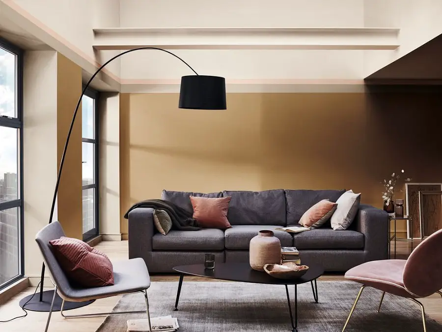
So it's time to think, dream, love and actsays Akzo Nobel. And for that we need bright, calming spaces, we need light. And color, Spiced Honey (spiced honey) is chosen to give light. It is the color of honey, of amber, with many tones, according to one's desire. It is as if all colors were seen through an amber window.
The color is warm, discreet, with strong tones without being aggressive.
Sherwin-Williams goes back to the ancient roots of terracotta
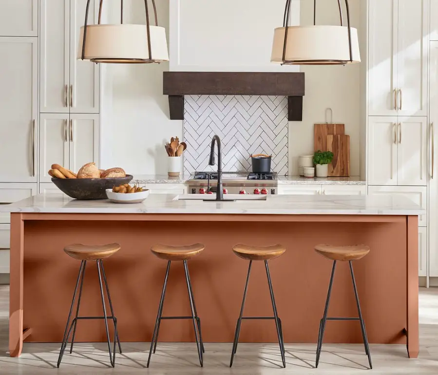
2019 color of the year proposed by Sherwin Williams is Cavern Clay, which means cave clay. The color is described as a warm scarlet color, a terracotta with roots in antiquity. It is a color that brings together old and new, technology and craftsmanship.
In the company's vision, 2019 will be a 70s revival. The chosen color is a color of the earth, of the natural, a color that brings to mind the beach, quiet houses covered with simple pottery, and holidays. It is a color that embodies simplicity, renewal, free spirit and bohemian flair.
The color is warm, calming and stable. It is suitable for decorating both homes and commercial premises.
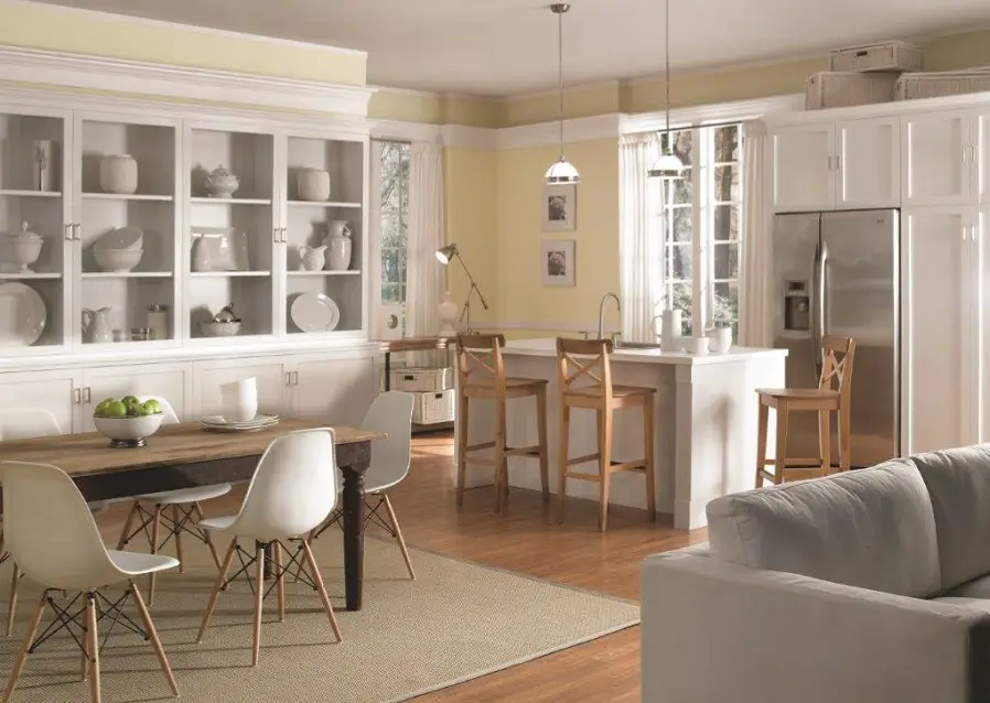
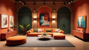
Behr's, PPG Paints and Dutch Boy Paints offer rich colors perfect for accents and personalization
If the above are discreet, natural colors, suitable to be the canvas on which to "paint" the rest of the room, the colors proposed by the three American firms are strong, suitable for tones. They are perfect for painting doors, windows, kitchen furniture, a chair to add a splash of color to a room.
Behr Paint propose BlueprintA full dusty blue that looks great on an entrance door or kitchen furniture.
Proposal PPG Paints is Night Watch, a deep, strong green that according to some experts will be very popular in 2019. Very suitable for wall accents, for kitchen or bathroom cabinets, for doors.
Colour of the year 2019 Dutch Boy Paints is Garden Patch. As the name says, the color is a garden patch, a light, raw, strong green. A color that, through the optimism it conveys, will create a good mood.
photo source: thecreativityexchange.com
photo source: thecreativityexchange.com
photo source: thecreativityexchange.com
Ace Hardwere (Clark + Kensington) let its customers choose the color of 2019
Shop network Ace Hardware, owner of the brand Clark + Kensington, decided to let the customers choose. He made the colors available to the customers and let them mix them as they wished. He then organized a contest where the winning color was chosen by 25 judges also chosen from among the customers.
The result was Pineapple Cream Granita, a pleasant, bright and upbeat creamy yellow. Used to color walls, it will "widen" rooms, giving a feeling of space. Great for drapes or sofas, and irresistible in combination with white.
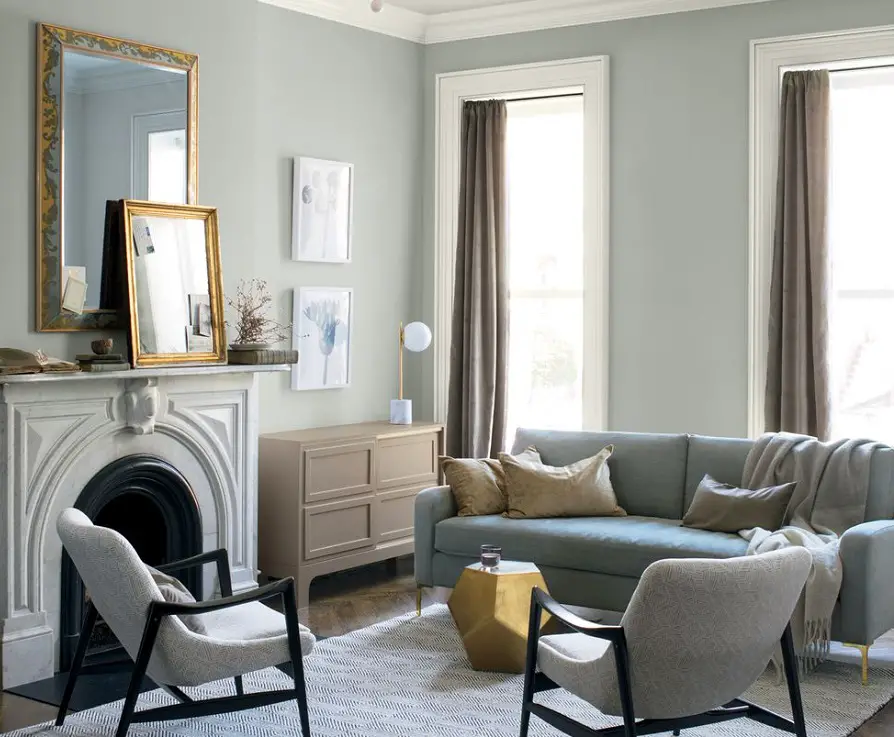
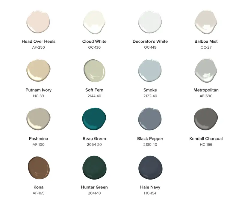
Benjamin Moore goes from 2018's bold color to a calm, balanced gray
Hot, the color of the year 2018, that fiery red, created a powerful impression. Full color with a lot of personalente, Caliente is more suitable for accents, for patches of color that give energy, positivity.
For 2019 Benjamin Moore proposes a discreet, calm color, a color that creates balance. Metropolitan, color of the year 2019, is a warm and sophisticated gray. It is a color in the neutral spectrum suitable for contemplation. The color does not draw the eye like Caliente, but creates a powerful space through the tranquility and stability it conveys.
Unlike previous years, Benjamin Moore launches and Color Trends 2019a palette of shades from pale grays to greens and blues that complement Metropolitan. The shades perfectly match the proposed gray, creating together beautifully harmonized decors.
Pantone Color Institute proposes a color palette inspired by London Fashion Week
The reciprocal influence between fashion and interior design has determined Pantone Color Institute to bring back from London Fashion Week a palette of 12 strong colors and four classic neutrals. They're energizing, confidence-boosting and uplifting colors, a boost to face the future. Colors that transcend sensuality, a palette that is dynamic and vibrant without being overwhelming.
To get an idea of what these colors mean, here's what their descriptions sound like:
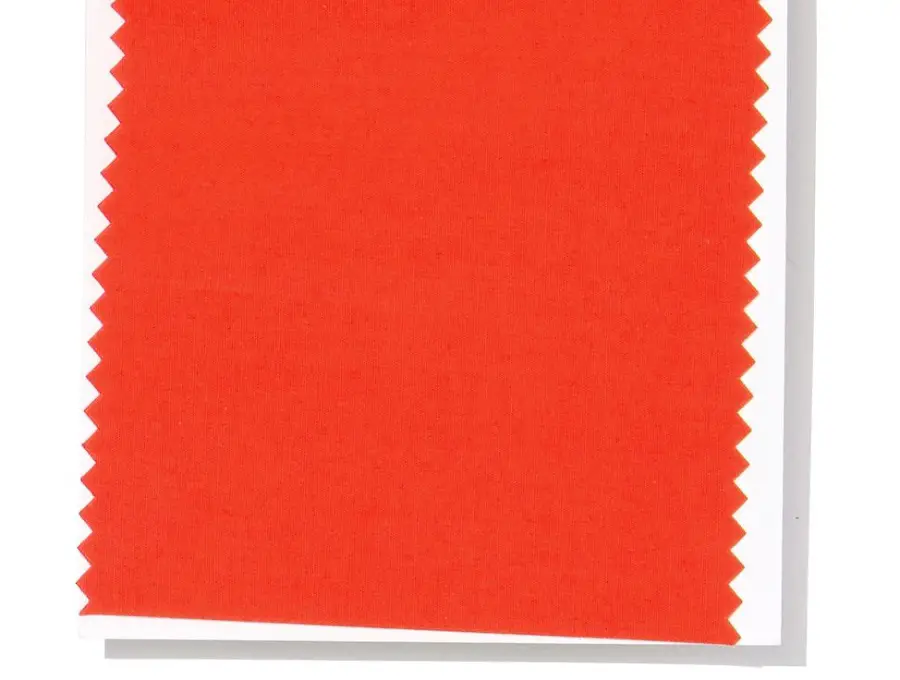
- Party - a festive reddish orange that radiates energy, passion and enthusiasm
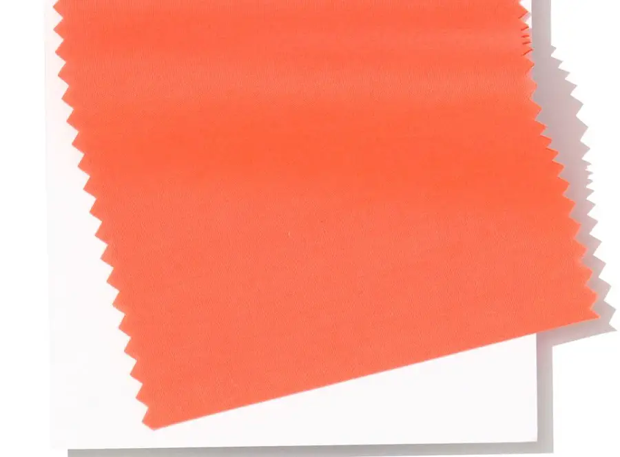
- Living Coral - an appealing and lively hue whose subtle golden hue sweetens
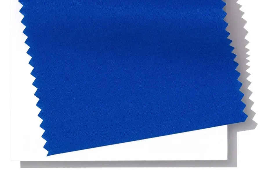
- Princess Blue - a majestic royal blue that glows and radiates
The proposal is for the spring-summer season, so we expect that by the end of the year other proposals will come out, maybe even the color of the year (Later edit: Living Coral has been chosen as the color of 2019 by Pantone).
Year after year, we discover how companies not only bring to the forefront a singular proposal for the color of the year, but make several proposals even within the same company. The major manufacturers propose a base color that, like a locomotive, pulls behind it a range of other colors that match and complement the one considered the leader. It is a welcome diversification that allows each of us to find a connection with at least one of the proposals, to find balance, peace and energy in a space decorated and colored in the trend of the year.
Your comments are welcome below. Share the article if you find it useful. Thanks.


Add comment