


Last year, in early December, Pantone was announcing the 2018 Color of the Year. Unlike in previous years, when the colors chosen suggested closeness to nature (Greenery in 2017) or serene delicacy (Rose Quartz & Serenity in 2016), for 2018 a strong, bold, dominant color was chosen - Ultra Violet. Looking to find out more about this color and especially what designers think about this choice, I discovered that there are several colors of the year. Several big names in the paint world have chosen their own color of the year for 2018, and the presentations have been made in the most convincing images.
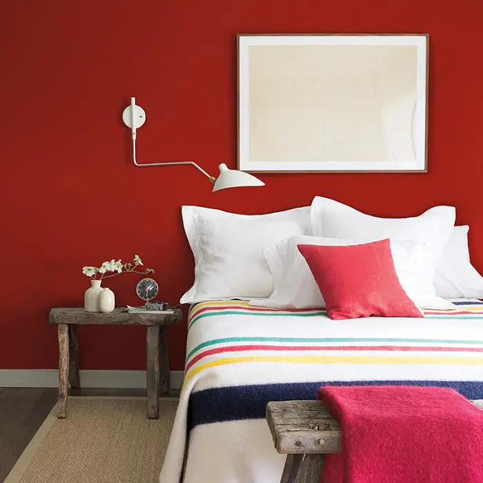
Almost 2 months before Pantone's announcement, Benjamin Moorepresents its own choice for the 2018 color of the year. There was a lot of talk leading up to the official announcement, speculation and speculation, and the color of choice lived up to expectations. A vibrant, passionate and energetic color, a vibrant, passionate and energetic return to life, with a name to match - Callente (hot, in Spanish, read caliente).
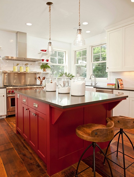
The color was launched in October 2017 at the Guggenheim Museum in New York, along with a series of 22 other colors that the designers think are a great fit for 2018's color of the year. The palette includes several shades of pink and red alongside neutrals and white.
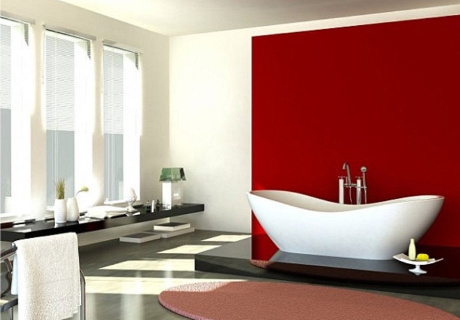
The Guggenheim launch also featured a series of interior decoration made with Callente and the other colors in the series, proving that they are colors to suit any style, whether classic, rustic, modern or futuristic. Callente manages to create a vibrant, energetic atmosphere in each of them.
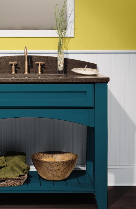
Also in October 2017, the Sherwin-Williams 2018 color of the year announcement. It is Oceanside, a mix of blue and emerald green. It was presented as a color of adventure, mermaid stories and expeditions on seas and oceans. The company's marketing director said at the launch that it is the color of the wanderer brought into our home, a color as adventurous and versatile as peacock tail blue.
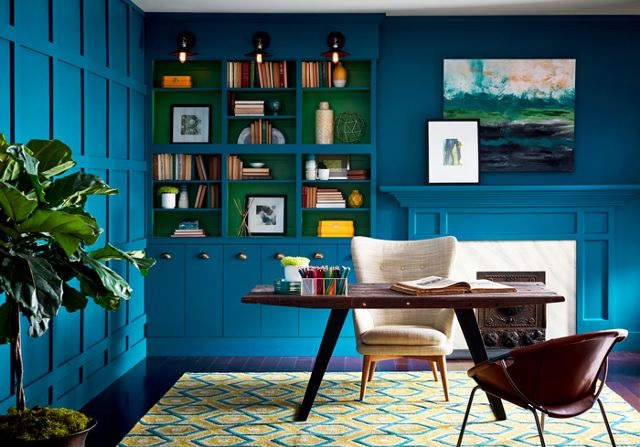
Even though it was presented as an adventure in itself, the color is pleasing and can be adapted to any room. From the bedroom to the bathroom to the kitchen, Oceanside finds its place, whether on the wall, on furniture or interior decoration.
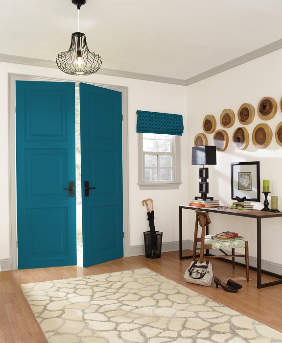
It's a color that goes well with white walls, but also with strong colors like yellow. It can be used to paint all the walls of the room or just to add a splash of color. The entrance door painted with Oceanside is sure to bring the whole house out of anonymity.
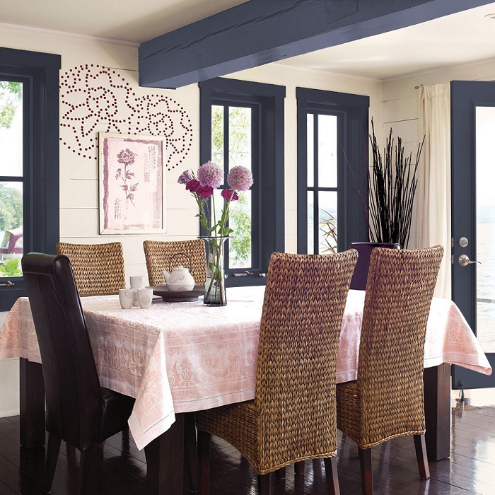
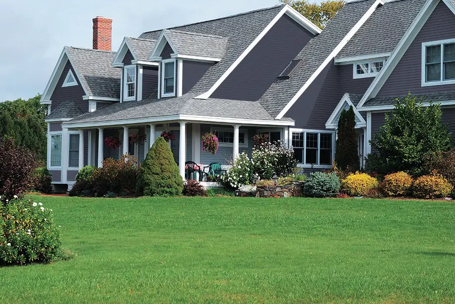
PPG Paint proposes a sober and elegant color - Black Flame (black flame). The color is a mix of black and indigo, leaning more towards anthracite gray than black. The color experts at PPG present it as a color of intimacy, of elegance, a color that combines the sobriety of a tuxedo with the elegance of a black evening dress.
The Marketing Director at PPG said at the launch that Blake Flame is the canvas on which the other decor elements can be displayed. It is a blend of two classic and elegant colors, black and indigo. Black suggests silence, the stillness so necessary in a world full of information, and indigo, hope. The resulting mix is a very versatile color that can be used to color walls or ceilings, and is also very suitable for staircases, interior or exterior doors, wardrobes and even exterior house painting. It can bring luxury and elegance to spaces with lots of white, pink, red or pastel colors.
Before its launch, the color was subjected to the scrutiny of designers from around the world who specialize in consumer electronics, aerospace, architecture or automotive colors. They analyze consumer preferences, trends in materials used to make products and interior decoration. The PPG specialists' great joy was that 20 of these specialists chose the color as very elegant and in line with consumer demands.
2018 color of the year proposed by Dulux is Heart Wood (heart of wood) and has been announced since September 2017. Dulux presented it as a color resulting from the warmth of wood, so widely used by architects and designers, with a slight hint of natural leather. Wood represents the comfort and security we need in these uncertain times. It's a color that combines the natural shades of wood - brown, red, as well as purple and pink - with a hint of natural leather.
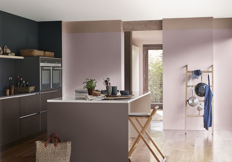
The color is light, neutral and complementary. It can easily be used to paint walls and other objects in the home. Dulux experts say it's a color that will transform your home into a warm and welcoming place, in contrast to the uncertain world outside. It's the tranquility we need in an upside-down world, a color that's sure to be adored by designers.
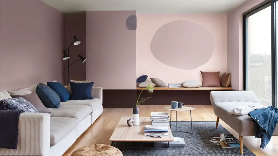
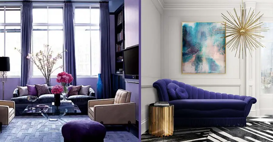
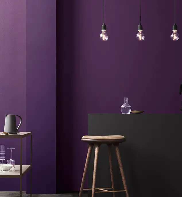
But back to Ultra Violet- color of the year 2018 launched by Pantone -I mentioned at the beginning. Pantone says this deep shade of purple has been chosen to bring originality, ingenuity and visionary thinking into the home. Basically it's a mood we need to have this year. We must have the strength to fight with boldness and originality.
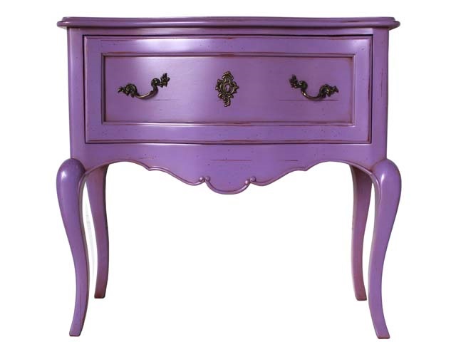
The Vice President of Pantone said that these are complex times and people's fear of moving forward has become visible. That's why strong, almost mystical colors are needed to give people the confidence and strength to carry on. This mix of purple and red will give you hope, a desire to move forward, but also a certain calm. It is a color that looks good on small furniture, sofas, but also on walls.
As you can see, the concern of all those who produce paints is to create our perfect space in a world that is becoming increasingly unpredictable. Colors have stories and inspire uscan influence our moods and it is good to keep this in mind when making our choices. Whatever the color of the year 2018 will be for you in furniture or interior design, I wish you a good and peaceful year, full of joy and achievements.


Add comment